Whether you’re designing for a hotel lobby, corporate office, or restaurant, understanding which colors have proven their staying power can save you from costly replacements and dated interiors.
This guide examines the most enduring rug colors across various commercial settings in North America, Europe, and the Middle East over the past decade.
We’ll explore both design-neutral tones and stylistic hues that have consistently performed well across different sectors.
Universal Timeless Rug Colors
Before diving into specific sectors, let’s look at the color families that have demonstrated remarkable staying power in nearly all commercial environments.
Neutral Foundations
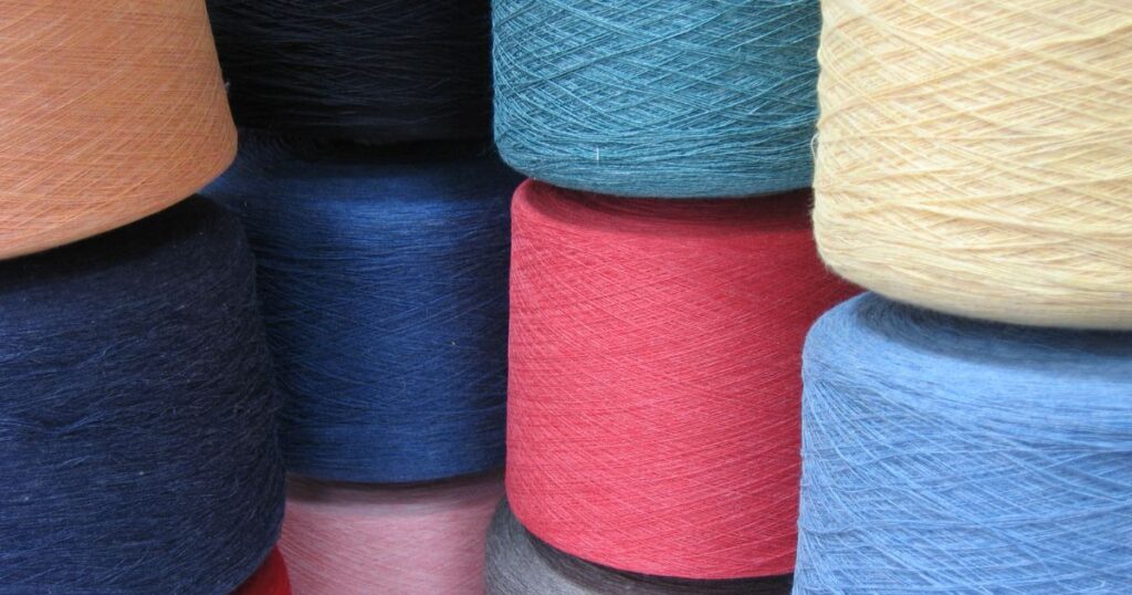
Neutral shades form the backbone of timeless commercial rug design:
Beige, Taupe, and Warm Neutrals: These versatile colors coordinate with changing furnishings and remain elegant year after year. They provide an understated backdrop that allows other design elements to shine.
Gray Family (Light to Charcoal): Grays have dominated commercial spaces for the past decade. From silver to charcoal, these tones offer a modern, clean look while hiding soil effectively.
Brown Tones: From light sand to deep chocolate, browns are practical and grounding. Dark brown is particularly effective at concealing stains in high-traffic areas.
Classic Color Staples
Beyond neutrals, certain colors have proven their enduring appeal:
Navy Blue: Often treated almost like a neutral, blue works well with most color schemes while adding a sense of calm and professionalism.
Burgundy/Wine Red: These deep reds carry associations with luxury and tradition, particularly in hospitality and entertainment venues.
Forest and Olive Green: These earthy greens function almost as neutrals while bringing a biophilic element to spaces. They hide stains well and add sophistication.
Black: As an accent or base color, black delivers timeless elegance and exceptional practicality for hiding soil.
Sector-Specific Colors
Hotel and Hospitality Spaces
Hotels require carpet colors that can withstand style changes and heavy use while maintaining an upscale feel.
Timeless Choices for Hotels
Lobbies and Public Areas: Warm beige, taupe, or stone-gray provide a versatile foundation. These colors complement changing furniture and seasonal decor while hiding moderate soil.
Corridors and High-Traffic Areas: Medium-to-dark neutrals with subtle patterns are ideal. Consider heathered gray-taupe or patterned beige with small-scale geometric designs to mask wear patterns.
Ballrooms and Event Spaces: Deep blues, burgundies, or patterns incorporating gold accents convey luxury and formality. These rich colors create an elegant backdrop for special occasions.
Guest Rooms: Soft neutrals like warm gray, light taupe, or greige (gray-beige) create a restful environment that complements various interior styles.
Regional Preferences
North America: Modern hotels favor cool grays, greiges, and blues with clean lines.
Europe: Contemporary European hotels embrace minimalist neutral palettes, while historic properties often preserve rich, patterned carpets featuring deep reds, blues, and golds.
Middle East: Luxury hotels frequently incorporate warm neutrals (beige, cream) with gold accents. Traditional patterns and jewel tones (burgundy, emerald, royal blue) appear more commonly than in Western markets.
Office Environments
Office carpeting must project professionalism while withstanding heavy daily use.
Timeless Office Carpet Colors
Open Work Areas: Medium gray, blue-gray, or taupe carpeting creates a professional backdrop that doesn’t distract. These colors hide soil while maintaining a clean appearance.
Executive Spaces: Deep blue or charcoal carpets convey authority and sophistication. Navy blue is particularly effective for creating a trustworthy, professional atmosphere.
Reception Areas: This is where you can incorporate a brand color or make a stronger statement. Emerald green signals prestige, while neutral grays with subtle brand-color accents create recognition without overwhelming.
High-Traffic Zones: Anthracite gray, dark brown, or black carpet tiles effectively conceal dirt in entries, corridors, and around copy machines.
Regional Nuances
North America: Office carpet tends toward cool neutrals (steel gray, blue-gray) with occasional brand-color accents in specific areas.
Europe: Northern European offices favor minimalist light colors, while Southern European offices sometimes incorporate warmer neutrals reflecting Mediterranean palettes.
Middle East: Corporate offices follow international styles (grays, blues), but local businesses may incorporate richer colors like deep blue or green in executive areas to signal formality.
Retail Stores
Retail carpeting should support the merchandise rather than compete with it.
Enduring Retail Carpet Colors
General Retail Floors: Medium grays, taupes, or beige create an elegant backdrop that puts focus on products. These colors work season after season as merchandise changes.
Luxury Boutiques: Dark, plush carpets in charcoal, espresso-brown, or deep navy create an exclusive atmosphere and dramatic contrast with displayed items.
Specialty Zones: Strategically placed carpet in brand colors can highlight specific departments or promotions. These are typically used sparingly and in smaller areas.
Regional Differences
North America and Europe: Most contemporary stores favor neutral backdrops with brand colors used as accents only.
Middle East: Luxury retail might incorporate more opulent carpeting, including richly colored rugs in VIP areas (patterned red, gold, or royal blue) to enhance exclusivity.
Restaurants and Dining Spaces
Restaurant carpets must create atmosphere while being exceptionally practical for spills and heavy traffic.
Time-Tested Restaurant Carpet Colors
Fine Dining: Deep, warm colors have endured for decades. Burgundy and wine red remain popular not just for tradition but because they hide food and wine stains beautifully.
Casual Dining: Dark neutrals (brown, charcoal) or patterned carpets with multiple dark tones effectively conceal inevitable spills.
Hotel Restaurants: Many feature patterned carpets with rich, classic color combinations (reds, blues, golds) that coordinate with the overall hotel scheme.
Private Dining Rooms: Deep greens create a clubby, traditional atmosphere that stays in style year after year.
Regional Preferences
North America: Steakhouses and upscale venues often feature burgundy or red carpets, while chains favor dark patterned carpets to hide wear.
Europe: Similar to North America, with historic establishments maintaining traditional patterns and colors as part of their brand identity.
Middle East: Fine dining features luxurious carpets with rich colors (reds, golds, deep blues) and more frequent use of ornamental designs with regional motifs.
Cinemas and Theaters
Entertainment venues have strong carpet color traditions that continue to endure.
Enduring Entertainment Venue Colors
Movie Theaters: Dark, patterned carpets (black or navy base with subtle colored motifs) hide spills while creating an upscale atmosphere. Modern cinemas have moved away from loud colors to more subdued burgundy, navy, and charcoal.
Live Performance Venues: The iconic deep red carpet tradition continues to dominate. This classic choice creates a sense of occasion and helps define the theater experience.
Auditoriums: Dark blue or purple sometimes appears as an alternative to red, while maintaining the richness and depth associated with performance spaces.
Regional Similarities
Theaters across regions show remarkable consistency in carpet color choices, with red dominating globally. Middle Eastern venues might incorporate more elaborate patterns or gold accents within the same color palette.
Exhibition Spaces and Trade Shows
Exhibition spaces require neutral, practical flooring that works with constantly changing displays.
Reliable Exhibition Carpet Colors
General Exhibition Floors: Medium-to-dark gray remains the standard across regions, offering a neutral backdrop that doesn’t compete with exhibits.
Trade Show Aisles: Charcoal, navy, or black provide a defining path while hiding tremendous foot traffic.
Zoning Areas: Some exhibitions use color-coding (different areas in gray, blue, or dark green) to help visitors navigate.
Consistent Across Regions
Exhibition carpet colors show minimal regional variation, with neutrals (particularly grays) dominating globally due to their versatility and practicality.
Museums and Galleries
Museums prioritize color neutrality to avoid interfering with displayed works.
Museum-Appropriate Carpet Colors
Gallery Spaces: Soft grays, taupes, or muted browns ensure artwork remains the focus. These colors neither reflect onto nor visually compete with exhibits.
Circulation Areas: Slightly darker neutrals (gray-brown, charcoal) hide footprints while maintaining the calm atmosphere.
Special Exhibition Areas: Context-appropriate neutral colors may be used temporarily. For example, a sandy beige for an Egyptian artifact display.
Global Consensus
Museum carpet color choices maintain remarkable consistency across regions, with the primary focus being neutrality that doesn’t detract from exhibits.
Regional Color Preferences Overview
North America
Dominant Approach: Practical, brand-neutral colors with an emphasis on clean, modern aesthetics.
Color Palette: Cool neutrals (gray, blue-gray, beige) dominate commercial spaces.
Accent Strategy: Controlled use of brand colors in specific areas rather than broad application.
Europe
Northern/Western Europe: Similar to North America but with more textural or patterned neutrals.
Southern Europe: Warmer neutrals (beige, terracotta, gold tones) reflecting Mediterranean influences.
Traditional European Spaces: Preservation of classic rich colors and patterns (reds, blues, greens) in heritage buildings.
Middle East
Neutral Base: Warm neutrals (beige, cream, taupe) rather than cool grays.
Luxury Approach: Greater comfort with incorporating jewel tones (burgundy, emerald, royal blue) and gold.
Cultural Integration: Traditional patterns and colors (Persian rug influences) used more frequently as timeless design elements.
Practical Color Selection Strategies
Balancing Aesthetics and Function
When selecting carpet colors for commercial spaces, consider these practical factors:
Traffic Patterns: Darker colors or multi-toned patterns hide soil best in high-traffic areas.
Maintenance Requirements: Very light colors require frequent cleaning; very dark colors show lint and dust.
Lighting Conditions: Colors appear different under various lighting types. Test samples in your actual space before committing.
Color Psychology: Consider the emotional impact of colors. Blues create calm, reds stimulate energy, greens reduce stress.
The Neutral Base + Accent Formula
A time-tested approach to timeless color selection:
Cover most flooring with neutral, versatile colors (grays, beiges, browns).
Add classic accent colors (navy, burgundy, forest green) in smaller areas or as borders.
Incorporate brand colors strategically in limited quantities where they’ll make the most impact.
Looking Forward: Timeless Colors That Endure
The most enduring commercial carpet colors succeed because they balance aesthetics, versatility, and functionality. While specific tints may vary slightly with broader design trends (warmer vs. cooler neutrals), the fundamental palette remains consistent.
When buying commercial rugs, focus on these qualities:
- Adaptability: Colors that work with various interior updates
- Appropriate Atmosphere: Colors that create the right mood for your space
- Practical Performance: Colors that handle real-world conditions
Custom Color Consultation
Design a hotel lobby that needs to withstand changing trends, an office that projects professionalism, or a restaurant requiring maximum stain resistance, we can help you select the perfect color palette.
Contact us today to discuss your commercial rug project and receive expert guidance on timeless color selection tailored to your specific needs.