Selecting the right rug for your space involves more than just finding something that looks nice.
The color of your rug can dramatically affect how a room feels, functions, and flows.
Whether you’re furnishing your first apartment or refreshing your office space, understanding the basics of rug color psychology can help you make choices that create the perfect atmosphere.
Color psychology is the study of how colors influence human behavior and emotions.
It plays a significant role in interior design, including choosing the right rug color to create the desired atmosphere in a space.
Colors can evoke specific moods, change perceptions of room size and shape, and tie together or clash with existing decor.
Understanding the basics of color psychology empowers buyers to make rug choices that enhance their homes.
Why Rug Color Matters
Have you ever walked into a room and immediately felt calm, energized, or cozy without knowing exactly why? Color plays a huge role in shaping our emotional responses to spaces. A rug, covering a significant portion of floor space, serves as a foundation for your room’s entire mood.
As interior design experts note, “Color doesn’t just affect how a room looks; it influences how a space feels, how large or small it appears, and even how it functions on a day-to-day basis.” A rug often acts as the element that ties a room’s design together, setting the tone for everything else.
The Basics of Color Psychology in Rugs
Let’s break down the fundamental ways that rug colors affect our spaces:
Warm vs. Cool Tones
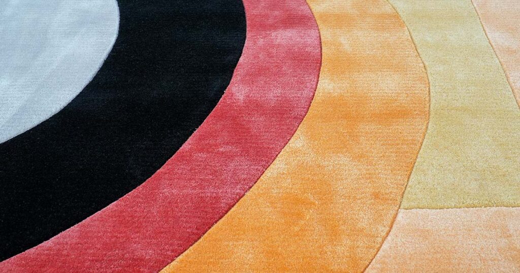
Warm colors (reds, oranges, yellows) create cozy, energizing atmospheres. They literally “warm up” a space’s vibe and encourage activity and interaction. A red or orange rug can infuse a room with vitality, while a golden-yellow rug brings cheerful optimism to a space.
Cool colors (blues, greens, purples) establish calm, serene environments. A blue rug can evoke the tranquility of sky or ocean, making it perfect for areas where you want to reduce stress. Green rugs connect us to nature and create balance, while purple adds a creative or luxurious calm.
Practical tip:
- Consider the room’s purpose. Need a lively conversation area? Warm tones might work best. Creating a peaceful retreat? Cool tones could be ideal.
Light vs. Dark Shades
The brightness or darkness of your rug color (its value) significantly impacts spatial perception:
Light-colored rugs make spaces feel larger, brighter, and more airy. They reflect more light, which can visually expand a room—perfect for small spaces or areas with limited natural light.
Dark-colored rugs make spaces feel smaller, cozier, and more intimate. They absorb light and add depth, which enhances privacy and comfort. This is why many upscale restaurants or lounges opt for darker carpets—they create a sense of intimacy and elegance.
Practical tip:
- Dark rugs also have the advantage of hiding dirt and stains better.
- They are practical choices for high-traffic areas or households with children and pets.
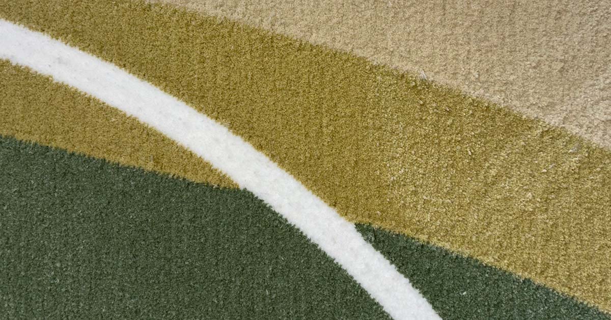
Neutral vs. Vibrant Hues
Neutral rugs (whites, grays, beiges, taupes, blacks) are timeless and versatile. They create a calm foundation that won’t clash with other décor and allows furniture or artwork to take center stage. Neutrals rarely go out of style or tire the eye.
Vibrant rugs (bold, saturated colors) act as eye-catching focal points and inject personality and emotion into a space. A vividly colored rug—whether turquoise blue, fiery orange, or vibrant purple—immediately draws attention and can transform an otherwise plain room.
Practical tip:
- If your furniture and walls are colorful or patterned, a neutral rug can provide balance.
- If your room is mostly neutral, a vibrant rug can add much-needed visual interest.
Room-Specific Recommendations
Different spaces serve different purposes, and rug colors can enhance these functions:
Living Rooms
The living room is often where we gather, entertain, and relax, so versatility is key:
For conversation areas: Consider warm-toned rugs (reds, oranges) to encourage social interaction and create an inviting atmosphere.
For relaxation zones: Blues and greens promote calmness and can help make a living room feel like a peaceful retreat.
For multipurpose living rooms: Neutral rugs with subtle patterns or texture provide flexibility, while still adding visual interest.
Bedrooms
Your bedroom should promote rest and rejuvenation:
For better sleep: Cool colors like soft blues, lavenders, or sage greens can create a tranquil environment conducive to rest.
For a cozy sanctuary: Warm neutrals like beige or taupe provide comfort without stimulation.
For romantic spaces: Deep jewel tones like burgundy or navy can create intimacy and luxury.
Home Offices
Productivity and focus are priorities in a workspace:
For concentration: Blues promote focus and mental clarity.
For creativity: Accents of yellow or orange can stimulate innovative thinking.
For professionalism: Neutral grays or blues with subtle patterns offer a classic, distraction-free foundation.
Dining Rooms
The dining room is where we nourish body and soul:
For appetizing environments: Warm colors like reds and oranges can actually stimulate appetite and conversation.
For formal dining: Deep, rich colors like burgundy, navy, or forest green add elegance and sophistication.
For casual dining: Light neutrals or soft greens create a fresh, everyday atmosphere.
Practical Considerations
Beyond psychology, there are practical factors that might influence your rug color choice:
Hiding Dirt and Wear
Let’s be honest—rugs in high-traffic areas will show dirt eventually. If you have kids, pets, or frequently entertain, consider:
Medium-toned rugs that won’t show dirt as easily as very light ones
Patterned rugs that can camouflage small stains or crumbs
Rugs with some color variation or texture that hide imperfections
Room Size Perception
Rug colors can visually alter room dimensions:
To make a small room seem larger: Choose light-colored rugs
To make a cavernous space feel cozier: Opt for darker rugs
To define zones in an open floor plan: Use different colored rugs to create visual boundaries
Lighting Effects
The same rug can look different depending on your lighting:
Natural daylight reveals true colors
Incandescent lighting brings out warm tones
LED lighting might make cool colors appear more intense
Always look at rug samples in your actual space before purchasing, as colors can appear drastically different under various lighting conditions.
Cultural and Regional Influences
Rug color preferences vary globally, influenced by climate, culture, and design traditions:
North American Preferences
North American design often features:
Versatile neutrals (beige, gray) as safe, adaptable choices
Nature-inspired colors (greens, blues, earth tones) reflecting outdoor connections
Occasional bold accent colors to express personality
European Tendencies
European interiors typically balance tradition with innovation:
Northern Europe favors cooler, muted palettes (whites, soft blues, grays)
Southern Europe embraces warmer, sun-soaked hues (terracotta, golden yellow, olive)
Classic patterns often featuring deep reds and navy blues remain popular
Middle Eastern Traditions
he Middle East has a rich carpet heritage with:
Vibrant, rich colors (deep reds, blues, golds) with cultural significance
Earthy hues reflecting desert landscapes (sand, clay, burnt sienna)
Symbolic color choices (green associated with paradise, blue with protection)
Understanding these influences can help you identify which aesthetic resonates with your personal style.
How to Choose Your Rug Color
Now that you understand the psychology and practicalities, here’s how to make your final decision:
Consider the room’s purpose: What feeling do you want to create? Energetic, peaceful, focused?
Take stock of existing colors: Look at your walls, furniture, and décor. Do you want your rug to complement, contrast, or coordinate?
Think about your lifestyle: Do you have kids or pets? Is the space high-traffic? How often are you willing to clean?
Test before you invest: Get samples or view rugs in your actual space with your lighting before making a final decision.
Trust your personal response: While color psychology provides guidelines, your own emotional reaction to a color matters most. Choose colors that make you feel good!
Ready to Find Your Perfect Rug?
Ready to explore your options?
Our design experts are also available for personalized consultations to help you find the perfect match for your space and style.
Remember, the best rug isn’t just the one that looks good—it’s the one that makes your space feel exactly the way you want it to feel.