Warm vs. Cool Colors
Warm colors (reds, oranges, yellows) create energizing, inviting environments.
In commercial settings, warm-toned rugs can make large hotel lobbies feel more intimate or retail spaces more engaging.
Cool colors (blues, greens, purples) deliver a calming, professional atmosphere.
These work exceptionally well in office environments, healthcare facilities, and museum spaces where a serene ambiance is desired.
The psychological impact matters tremendously in commercial spaces.
A hotel restaurant might benefit from warm tones to stimulate appetite and conversation, while a spa lounge would better serve clients with cool, tranquil hues.
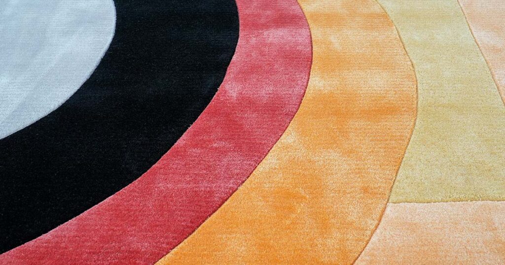
Contrast vs. Harmony
Successful rug designs balance visual interest (contrast) with cohesiveness (harmony):
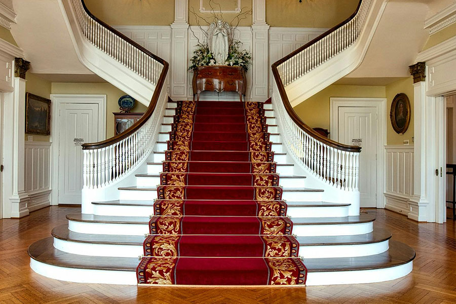
High contrast rugs, like those with bold black and white patterns, become dramatic focal points – perfect for statement areas in hotel lobbies or retail entrances.
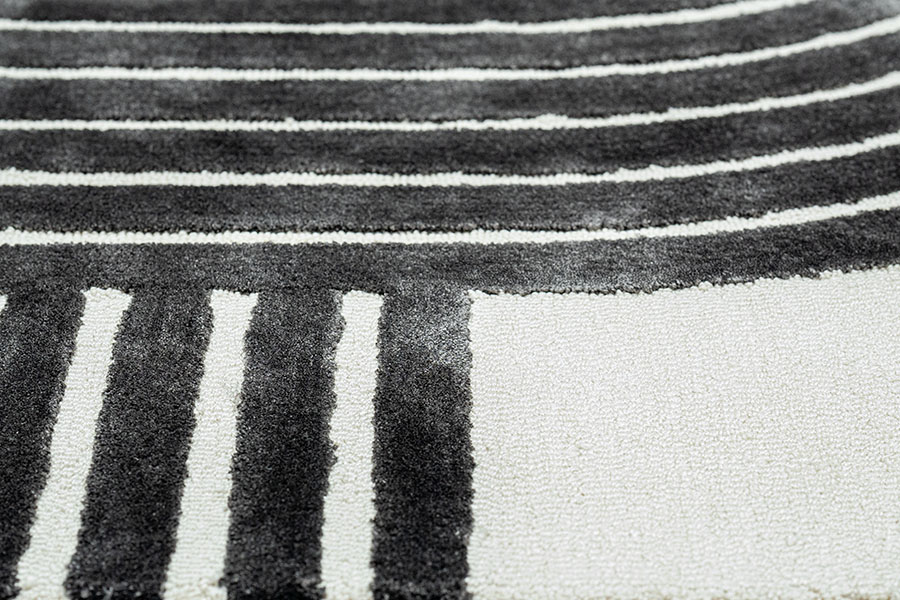
Harmonious designs use related colors for a more subtle, unified presence.
A museum might prefer a harmonious rug with minimal contrast to avoid competing with exhibits.
Most effective commercial rugs employ strategic contrast against a harmonious base.
- For example, an office carpet might feature mainly harmonious blues with a contrasting accent stripe in the company’s signature color.
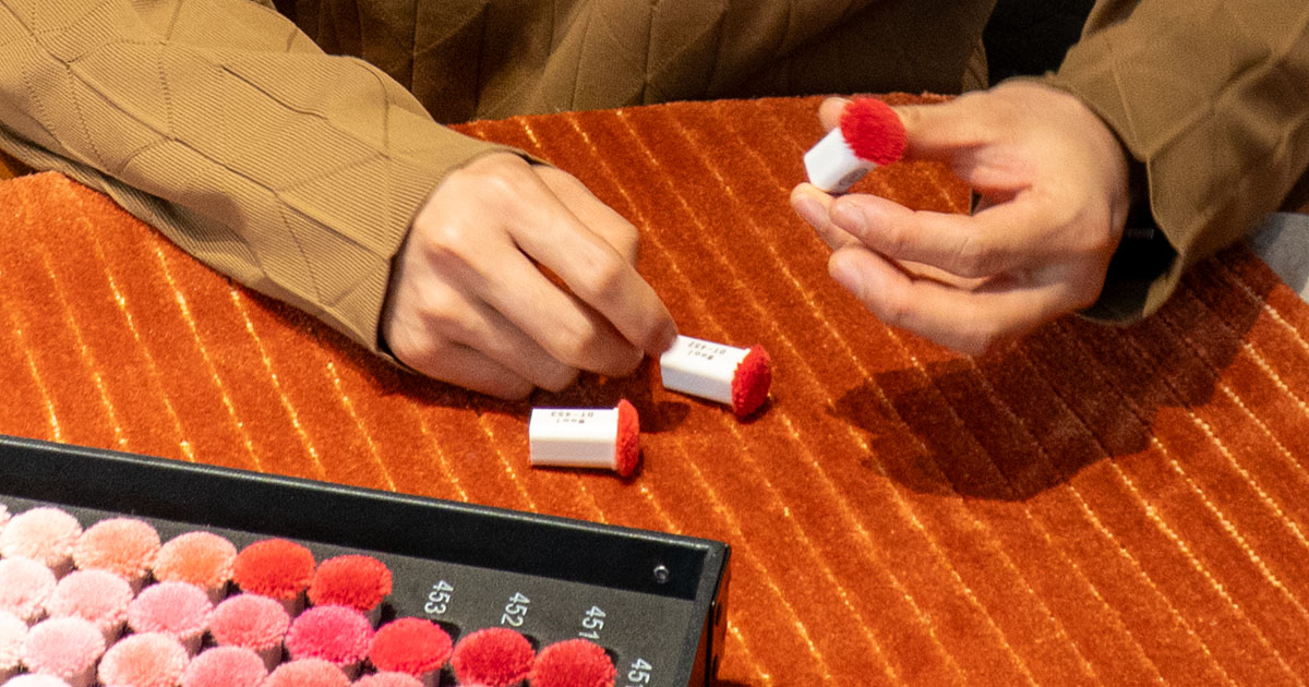
New Zealand Wool: Superior Medium for Colors
Custom tufted rugs commonly use New Zealand wool, and for good reason.
This premium material offers significant advantages for color application:
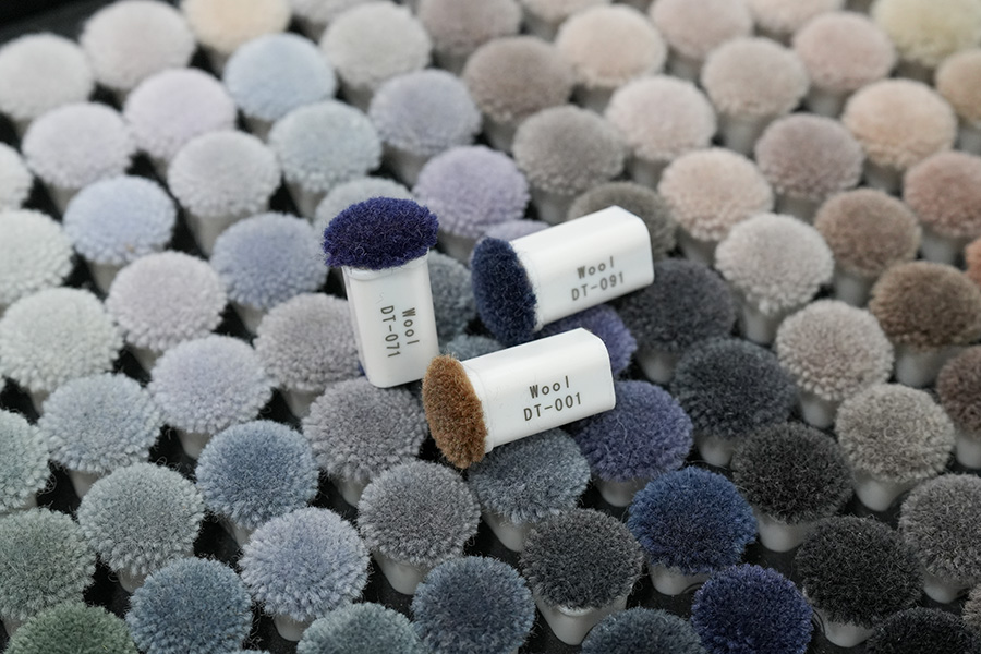
Rich Color Depth
Wool’s complex protein structure readily accepts dyes and locks in color. Commercial spaces benefit from wool’s exceptional color-fastness – maintaining vibrant hues even in high-traffic areas like hotel lobbies.
Natural Luster
Wool has a gentle sheen that makes colors appear more luxurious. A navy wool rug isn’t a flat blue – the fiber’s light-reflecting properties add depth that synthetic materials can’t match.
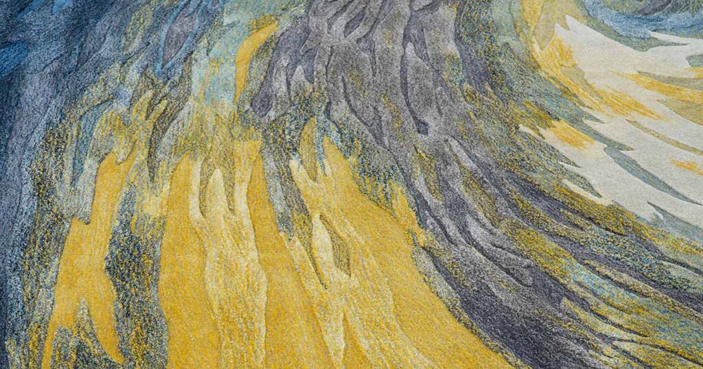
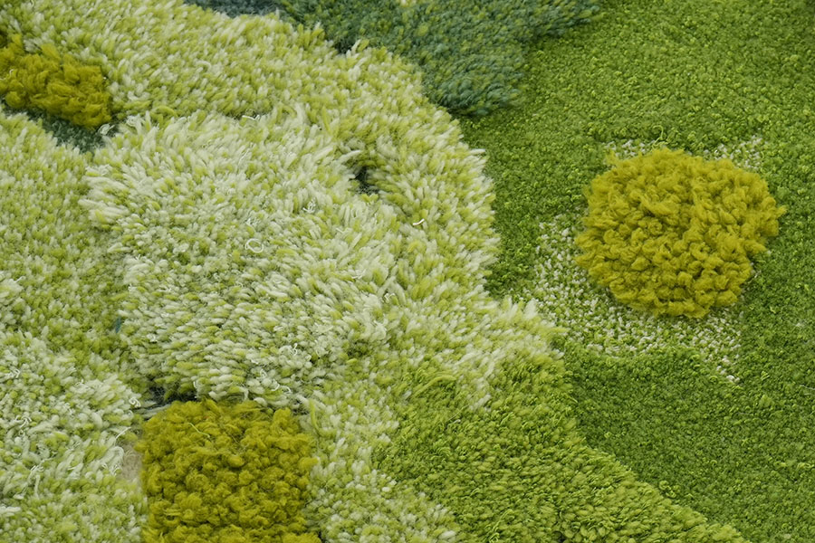
Textural Dimension
Wool’s varied textures (cut pile, loop pile, sculpted) interact with light differently, creating tonal effects even within a single color. A monochromatic wool rug gains interest through texture alone.
Practical Durability
Wool maintains its appearance through crushing and wear, keeping colors vibrant and patterns crisp over years of commercial use. Its natural soil resistance keeps colors looking fresh with regular maintenance.