Color coordination between rugs and couches forms the foundation of successful interior design in commercial spaces.
The right combination can transform a hotel lobby, corporate lounge, or restaurant into a welcoming environment that leaves a lasting impression on clients and guests.
In this comprehensive guide, we’ll explore key color pairing principles, regional preferences across North America, Europe, and the Middle East.
And practical factors that influence color decisions in commercial settings.
The Role of Rugs and Couches
Rugs and couches are more than just functional pieces; they play crucial roles in commercial interior design:
- Rugs: Define spaces, add warmth, reduce noise, and protect flooring
- Couches: Serve as focal points, provide seating, and influence room layout
- Together: Create a cohesive look, balance the room, and set the overall tone of your business space
When choosing colors for these elements, consider how they will work together to achieve your desired aesthetic and business identity.
Understanding Color Theory Basics
Before diving into specific pairings, let’s explore the fundamental color relationships that guide professional designers:
Complementary Color Schemes
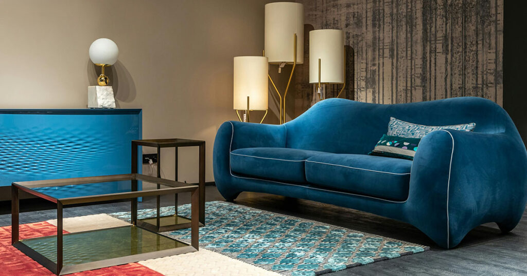
Complementary colors sit opposite each other on the color wheel (like blue and orange, or red and green).
When used together, they create a high-contrast, energetic look because they share no common hues.
Example in Action
A deep blue couch with a warm orange rug creates bold contrast that energizes a room and makes each piece stand out. This pairing works well in spaces where you want to create visual excitement.
Designers often balance complementary pairs by letting one color dominate and using the other as an accent. For instance, a corporate lobby with mostly blue furnishings might incorporate subtle orange elements in the rug’s pattern to add interest without overwhelming the space.
Analogous Color Schemes
Analogous colors are next to each other on the color wheel — such as blue with green, or red with orange. These combinations create harmony and are easy on the eyes because the colors are closely related.
Example in Action
A sage-green couch with a blue-green rug, or a rust-orange rug under a red-toned leather sofa creates a calm and cohesive effect.
This approach works beautifully when designers want a subtle, layered look without strong contrast. For example, a hotel lounge aiming for a soothing atmosphere might feature various shades of blue-green in upholstery and carpets for a unified feel.
Monochromatic Schemes
A monochromatic color scheme uses variations of a single hue. This means the rug, couch, and other major elements are all different tones, tints, or shades of one base color.
Example in Action
A commercial lounge might layer a light gray rug with a charcoal-gray sofa and slate-colored pillows, or a hotel reception area might feature an array of beige, tan, and cream in the seating and floor coverings.
Monochromatic pairings tend to look refined and unified. Because the palette is limited, designers rely on subtle differences in tone (adding gray), shade (adding black), or tint (adding white) to distinguish pieces.
Designers also use contrasting textures or finishes to add interest. For example, a blue monochromatic scheme could include a velvet navy sofa on a rug that’s a dusty blue flat-weave — the color is similar but the texture difference makes each piece distinct.
Neutral Layering
Neutral colors (whites, grays, beiges, browns) are versatile in design. Neutral layering refers to using a palette of neutral tones in different shades and layering them together for a rich yet subtle effect.
Professionals love working with neutrals because they are “simple, classic, and safe” in almost any environment — they rarely go out of style and won’t distract from other elements.
Example in Action
A hotel lobby might start with warm ivory walls, add a sand-beige sofa, and finish with an area rug in a soft taupe-gray — all quiet colors, but distinct enough from each other to establish layers.
A designer might then add small accents in a metallic or a single accent color (like navy blue cushions) to provide focal points without breaking the neutral harmony.
Regional Color Preferences
Color trends vary across regions, reflecting cultural influences, climate, and historical styles. Here’s how different regions approach rug and couch color pairings:
North American Approach
In North America, many commercial interiors favor a modern, approachable style with a foundation of neutral colors. Walk into a new hotel lobby or a tech company’s lounge in the U.S. or Canada, and you’re likely to see couches in versatile neutrals like gray, cream, taupe, or navy.
Neutral sofas are popular because they project a professional, clean look and allow flexibility — it’s easy to update the space by swapping out the rug or pillows rather than the couch.
Common Couch Colors
North American commercial spaces often use gray, beige, cream, or muted blues for large seating. These colors are seen as professional and calming, suitable for offices or hotels.
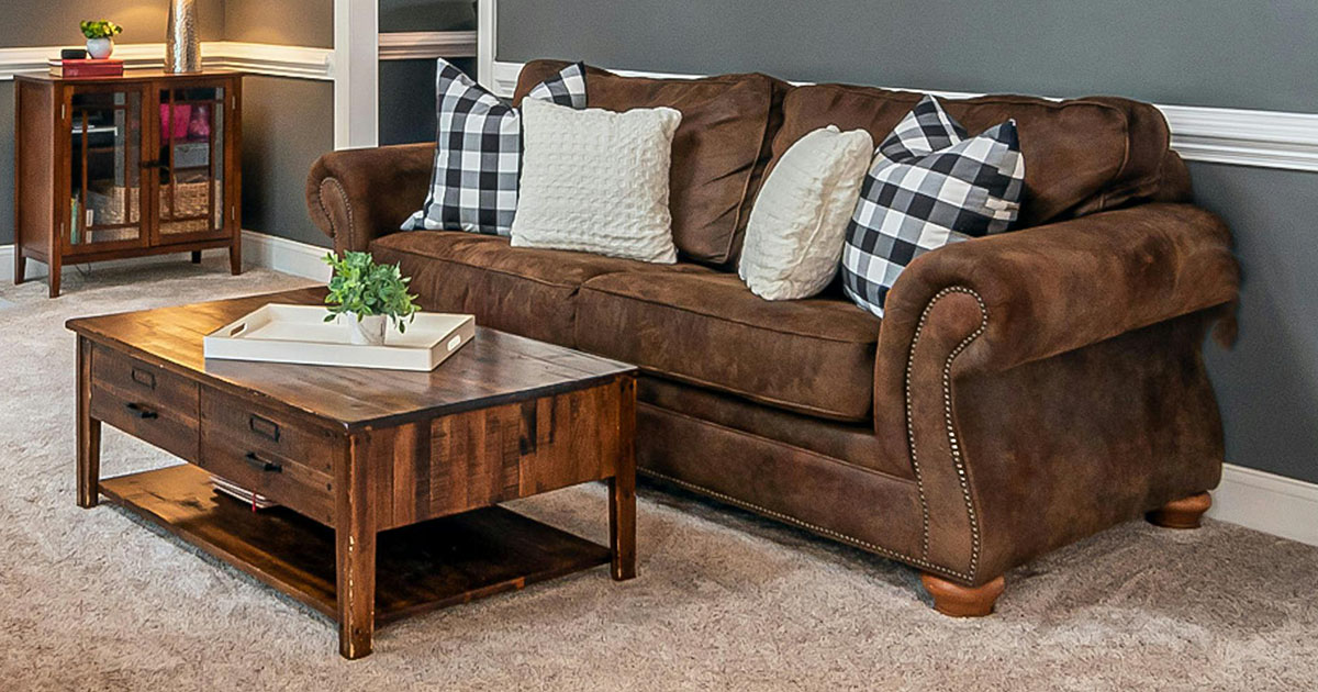
In hospitality settings, you may also find deep navy or forest-green sofas as statement pieces — deep greens have even been called “a new neutral” recently, taking a role similar to navy blue in designs. Rich leather browns are popular too, especially in traditional or upscale North American hotels and restaurants.
Rug Pairing Strategies
With a neutral or dark couch, designers in North America use rugs to either coordinate subtly or add contrast.
For coordination: A rug may pick up accent tones from the overall palette. For a gray couch, a rug might have a pattern that includes hints of gray, blue, or silver to tie it together. For example, a cool-gray sofa could be grounded by a blue-gray rug with a subtle abstract pattern, creating an analogous blue/gray scheme that feels cohesive.
For contrast: Alternatively, the rug can introduce a complementary or bold accent. Designers might place a golden-yellow rug under a deep blue couch (blue and yellow are opposite-ish on the color wheel and create lively contrast) or a vibrant patterned rug beneath a cream sofa to act as the room’s focal artwork on the floor.
It’s not unusual to see a neutral couch with a rug showcasing a bold color from the company’s brand palette or the hotel’s theme. For instance, a chic cafe in the U.S. might have all furniture in whites and tans but use a bright red rug to energize the space.
European Sensibilities
Europe is home to a diverse range of design traditions, which means rug and couch color pairings vary widely. However, a common thread in European commercial interiors is a sense of refinement and balance in color schemes.
Many modern European offices and hotels favor a clean, minimalist palette with couches in white, gray, taupe, or black, especially in Northern and Western Europe. This minimalist approach emphasizes neutral colors and clean lines.
For example, a sleek lobby in Germany or Scandinavia might feature a white or light gray sofa on a pale wood or stone floor, perhaps with a textured off-white rug, achieving an airy, uncluttered look.
European design also celebrates color — but usually in a strategic, controlled way. Rather than many colors competing, typically one accent color is allowed to shine against a restrained backdrop.
A noteworthy trend across Europe is the use of deep reds and other rich hues as accents in otherwise neutral interiors. Designers have found that introducing “a touch of red” into a mostly neutral or dark scheme can transform and elevate the space, adding warmth and luxury.
Regional Nuances
Northern Europe: Prefers minimalist, light-colored interiors. Common couch colors are white, light gray, beige, or pastel hues, often in simple forms. Rugs here are often used for texture and warmth (think fluffy white or gray rugs on wood floors) rather than as bold color statements.
Southern Europe: Tends toward warmer and more vibrant palettes. In countries like Spain, Italy, or Greece, you’ll find commercial interiors embracing warm earth tones and blues/greens that echo the landscape.
For example, a coastal Greek hotel lobby might pair a white or sand-colored couch with a rug containing Greek blue patterns, marrying neutrality with a strong local color. A restaurant in Italy could have burnt orange or olive-green banquette seating against terracotta tile floors, complemented by rugs or runners in golden yellow and deep blue.
Middle Eastern Traditions
The Middle East boasts a vibrant design heritage that significantly influences color choices in interiors. Commercial spaces in the Middle East — from luxurious hotel lobbies in Dubai to traditional lounges in Istanbul — often feature warm, opulent color schemes reflecting both cultural tradition and modern elegance.
Color palettes here tend to be bold and expressive, frequently drawing from the region’s landscapes and art. It’s common to see richly colored couches and ornate rugs used together, creating a sumptuous, inviting atmosphere.
Traditionally, Middle Eastern interiors celebrate warm earth tones and jewel hues. Many colors are inspired by nature: the sands of the desert, deep blue of the sky or sea, vibrant spices and flowers.
Middle Eastern interiors are typically “warm, cozy, inviting, and expressive,” using “shades of red, orange, yellow, gold, brown, and purple” that come “from the natural color palette of the region — the sun, the sand, and the spices.”
Common Couch Colors
There are two prominent directions for couch colors in Middle Eastern commercial design today:
Rich, vivid colors — Often used in heritage-inspired or opulent designs. It’s not unusual to see couches in jewel tones like emerald green, sapphire blue, ruby red, or in lush neutrals like chocolate brown and cinnamon.
Light neutrals and whites — Embraced in many contemporary, high-end spaces for a clean, elegant look. In recent years there has been a shift toward more modern, minimalist color trends in the Middle East.
For instance, a new hotel in Dubai or Doha might opt for expansive white sofas or sand-toned sectionals, using color more sparingly in accents. These neutral couches provide a luxurious-yet-modern canvas that still complements the region’s love of gold and pattern (gold detailing or patterned cushions can be added).
Rug Pairing Strategies
Rugs hold a special place in Middle Eastern design. Historically, the region is famous for its Persian and Oriental rugs, which are often richly patterned and colored.
When the couch is vividly colored or patterned, the rug often complements by containing that color among others. For example, if the seating in a lounge is upholstered in intricate red and gold brocade, the rug might be a Persian carpet that also has red and gold details in its motif.
If the sofas are neutral (white, beige, gray), the rug is usually where the explosion of color or pattern happens. A pristine white lobby couch can be paired with a vibrant traditional carpet — for instance, a multicolored Moroccan or Persian rug featuring geometric patterns in orange, blue, and green.
Pattern Mixing: Dos and Don’ts
When incorporating patterns in commercial spaces:
- Do: Vary the scale of patterns (e.g., large-scale pattern on the rug, small-scale on couch pillows)
- Do: Use a common color to tie different patterns together
- Don’t: Mix too many busy patterns in one space
- Don’t: Forget to include solid colors to give the eye a rest
Thoughtful pattern mixing can add depth and interest to your commercial environment.
For example, a hotel lobby might feature a large geometric pattern on the rug paired with subtle pinstripes on accent chairs, sharing a common color palette.
Practical Considerations
When selecting rug and couch color combinations for commercial environments, several practical factors come into play:
Lighting Effects
Lighting has a profound impact on colors. A rug and couch that look perfectly matched in daylight might look different under hotel lobby lamps or office fluorescents.
Natural Light: Sunlight shows colors in their truest form but changes throughout the day. In a lobby with large windows, the couch and rug will appear differently in morning sun versus afternoon. Intense direct sun can wash out pale colors and can actually make dark colors look brighter.
Artificial Light (color temperature): Different bulbs cast different “colors” of light. Warm lighting (incandescent or warm LEDs) has a yellowish glow. This warm light tends to enhance warm-toned colors (reds, oranges, yellows will look vibrant) but can dull cooler colors like blues or greens.
Pro Tip
In a restaurant with very warm, dim lighting, if you want a blue rug and gray sofa combination, you might need to choose a brighter or more saturated blue rug so that it doesn’t get lost under the warm light (which would otherwise mute it).
Size and Scale Considerations
Room Size and Color Intensity: In general, light colors and cool colors tend to make a space feel larger or more open, while dark colors and warm intense colors can make a space feel more intimate or smaller.
If you’re designing a small corporate lounge or a tight lobby, you might favor a light-colored couch and rug (e.g. soft beige sofa, pale blue rug) to visually expand the room. Large swaths of dark color in a small space can be overpowering.
For a spacious hotel lobby or open-plan office, you have more freedom to use darker or bolder colors without the space feeling cramped. A vast lobby with a 20-foot ceiling can beautifully accommodate a grouping of navy blue sofas on a rich burgundy and gold rug, because there’s plenty of volume and light to handle those strong colors.
Tips for Choosing the Right Rug Size
The size of your rug can impact the overall look in commercial spaces:
In lounges and waiting areas, aim for all furniture legs to be on the rug or at least the front legs
For dining areas, choose a rug large enough to accommodate chairs when pulled out
In large open spaces, use rugs to define different functional zones
In hallways or transitional spaces, runners can guide traffic flow while adding color
Proper rug sizing helps define spaces and creates a polished, professional look.
Texture and Material Considerations
Texture adds depth and interest to your color scheme:
Combine different textures for visual appeal (e.g., a plush rug with a leather couch)
Consider the durability of materials based on foot traffic and use patterns
Be aware that different materials can affect color perception
Choose commercial-grade materials that can withstand heavy use while maintaining appearance
Balancing textures can create a rich, layered look in your commercial space while addressing practical concerns.
Purpose and Mood
The intended function of the space should guide your color choices:
Corporate Environments
Corporate Lounges and Offices: These spaces typically aim for a professional, calming, yet inviting atmosphere. Often the color schemes are conservative or tied to company branding.
Common couch colors here are neutrals (gray, black, navy, beige) which convey professionalism. Rugs in corporate lounges might also stick to neutrals or subtle patterns to avoid distraction.
Blue is a favored color in corporate settings because it implies trust and stability. So you might see blue or blue-gray rugs paired with gray or brown couches in bank lounges or law firm waiting areas.
Hospitality Spaces
Hotel Lobbies and Lounges: Hotels vary by brand — some are trendy and eclectic, others are classic luxury, others are minimalist and spa-like.
The rug-couch pairing should echo the hotel’s identity.
Luxury five-star hotels in any region often use rich, coordinated color schemes to wow guests (e.g. emerald couch on a gold-accented rug for drama.
Or all neutrals and one signature color like a purple rug and floral arrangements for a boutique chic look).
The lighting in lobbies is often warm and low in the evening, encouraging the use of warm color schemes (or adding warm accent lighting to cooler schemes to keep it inviting).
Dining Environments
Restaurants and Cafes: Here, color can actively influence customer behavior and experience. Many restaurants use warm colors (reds, oranges, yellows) in their decor because these colors are believed to stimulate appetite and energy.
The pace of the place matters: for quick turnover eateries, brighter high-contrast colors can subtly encourage people to be energized (and not linger too long), whereas a loungey restaurant might use cooler and deeper colors (deep blues, greens, or neutrals) to calm people and encourage longer stays.
Matching Rug and Couch Colors with Existing Decor
To create a cohesive look in your commercial space:
- Choose colors that complement your wall color
- Consider the color of your flooring
- Coordinate with existing furniture and accessories
- Use accent colors from your rug in throw pillows or artwork
This approach will help tie the entire room together and create a polished, professional environment.
Winning Color Combinations
Based on the principles and regional preferences we’ve explored, here are some timeless rug and couch color combinations that work particularly well in commercial settings:
For Corporate Lobbies and Offices
Professional and Calm
Gray couches + Blue-gray patterned rug
Navy sofas + Light beige textured rug
Taupe seating + Sage green abstract rug
Brand-Forward but Sophisticated
Neutral couches (beige/gray) + Rug featuring brand accent color
Black leather seating + Rug with subtle pattern incorporating logo colors
Navy blue couches + Rust orange or gold accent rug
For Hotel Lobbies and Lounges
Luxury and Elegance
Emerald green velvet sofas + Gold and cream patterned rug
Cream or white couches + Deep blue oriental-style rug
Charcoal gray seating + Burgundy and navy patterned rug
Modern and Fresh
Light gray modular seating + Geometric rug in blues and grays
Sand-colored sofas + Aqua blue textured rug
White couches + Pale pink or soft gray rug with subtle pattern
For Restaurants and Cafes
Energetic and Lively
Burnt orange or terracotta banquettes + Blue-gray rug
Teal or turquoise seating + Warm neutral rug with geometric pattern
Rich brown leather seating + Rust red patterned rug
Refined and Intimate
Deep wine red seating + Dark neutral rug with subtle gold accents
Forest green couches + Muted gold patterned rug
Navy blue seating + Gray rug with navy accents
Common Mistakes to Avoid
Steer clear of these common pitfalls in commercial spaces:
- Choosing colors that clash rather than complement
- Ignoring undertones in neutral colors
- Overmatching colors, leading to a monotonous look
- Neglecting to consider the room’s overall color scheme
- Failing to account for existing wood tones in furniture or architectural elements
- Selecting impractical colors that show wear too quickly in high-traffic areas
Avoiding these mistakes will help ensure a harmonious color palette that maintains its appeal over time.
Key Takeaways
When selecting rug and couch colors for your commercial space, remember these fundamental guidelines:
- Consider your audience and brand identity – Choose colors that reflect your business personality and appeal to your target clientele.
- Evaluate your space’s lighting – Colors appear differently under various lighting conditions. Test samples in your actual space whenever possible.
- Balance is crucial – If your rug is bold and patterned, consider a more subdued couch (or vice versa) to maintain visual harmony.
Size matters – Lighter colors expand space visually, while darker colors create intimacy. Choose accordingly based on your room dimensions. - Purpose drives palette – Fast-paced environments benefit from energizing color contrasts, while relaxing spaces call for soothing analogous schemes.
- Regional context adds relevance – Consider local cultural preferences when designing spaces intended to appeal to specific regional clientele.
- When in doubt, neutrals work – A foundation of neutrals provides flexibility and timelessness, allowing for accent colors to be changed as needed.
By thoughtfully pairing rug and couch colors based on these principles, you’ll create commercial spaces that not only look professionally designed but also effectively support your business goals and customer experience.